illustration ★ packaging design ★ branding
adore skin + body
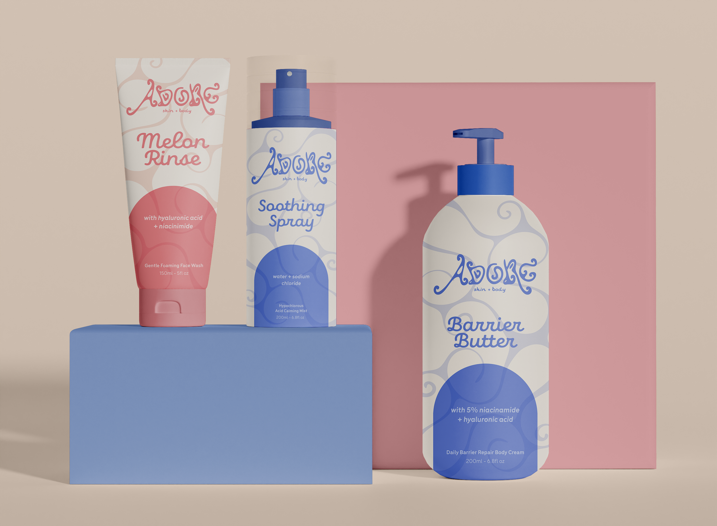
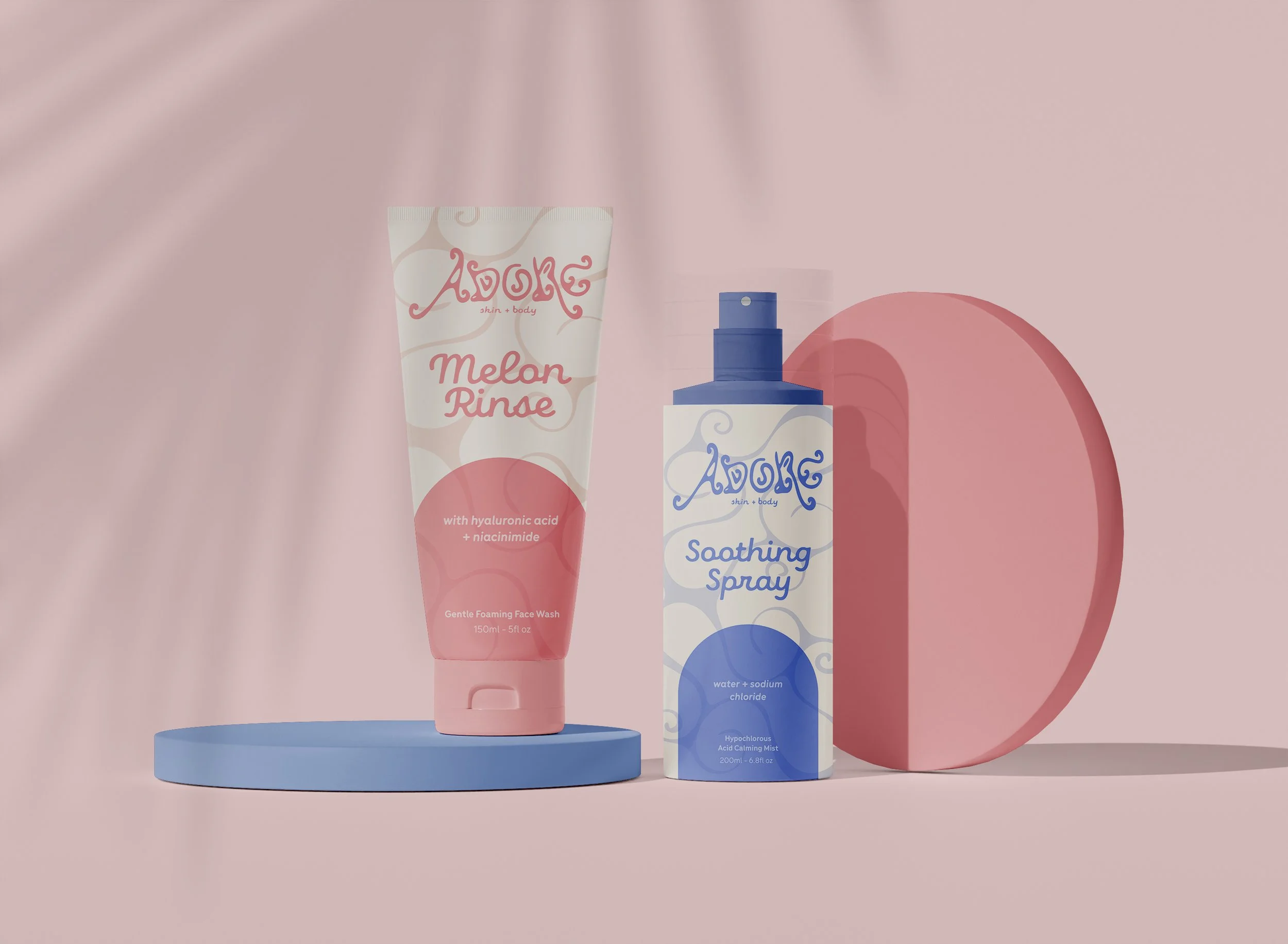
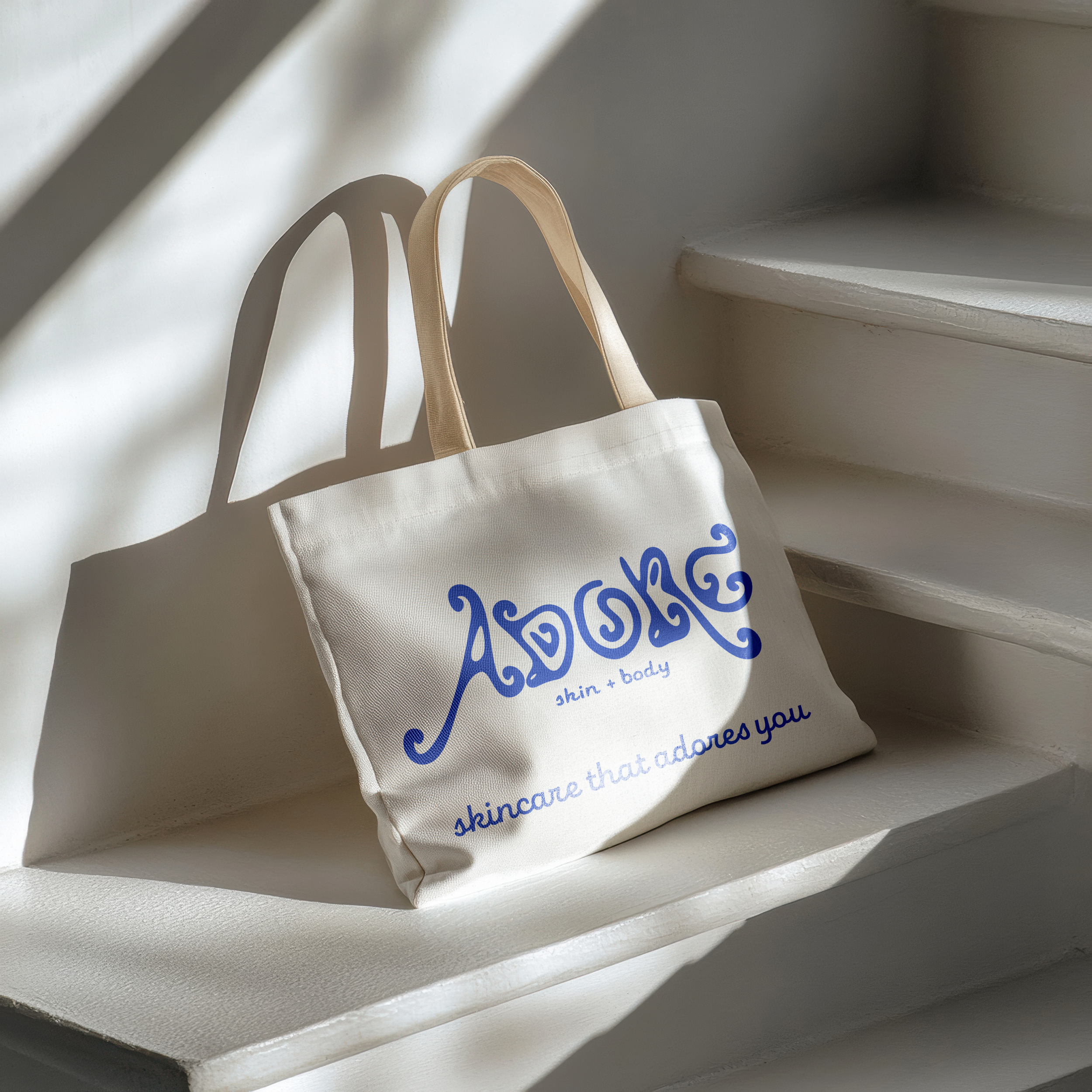
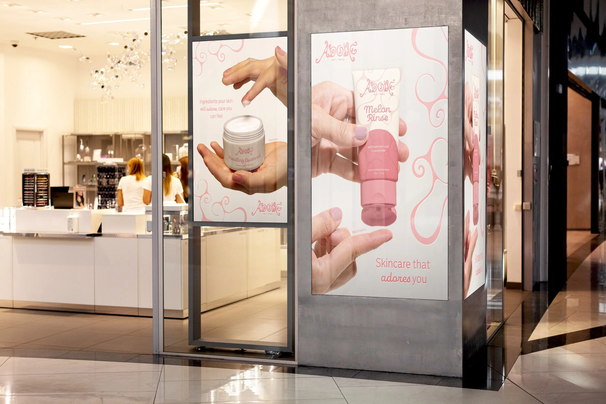
Adore Skin + Body is a conceptual care line for individuals with sensitive and eczema-prone skin. Adore’s logo and color palette were designed to feel playful and cute. Many products for eczema-prone skin use a simple, medical visual identity, so I explored a softer approach. The complimentary packaging text is rounded and fun to echo the logo, and an illustrative swirl was added to further complement the brand.
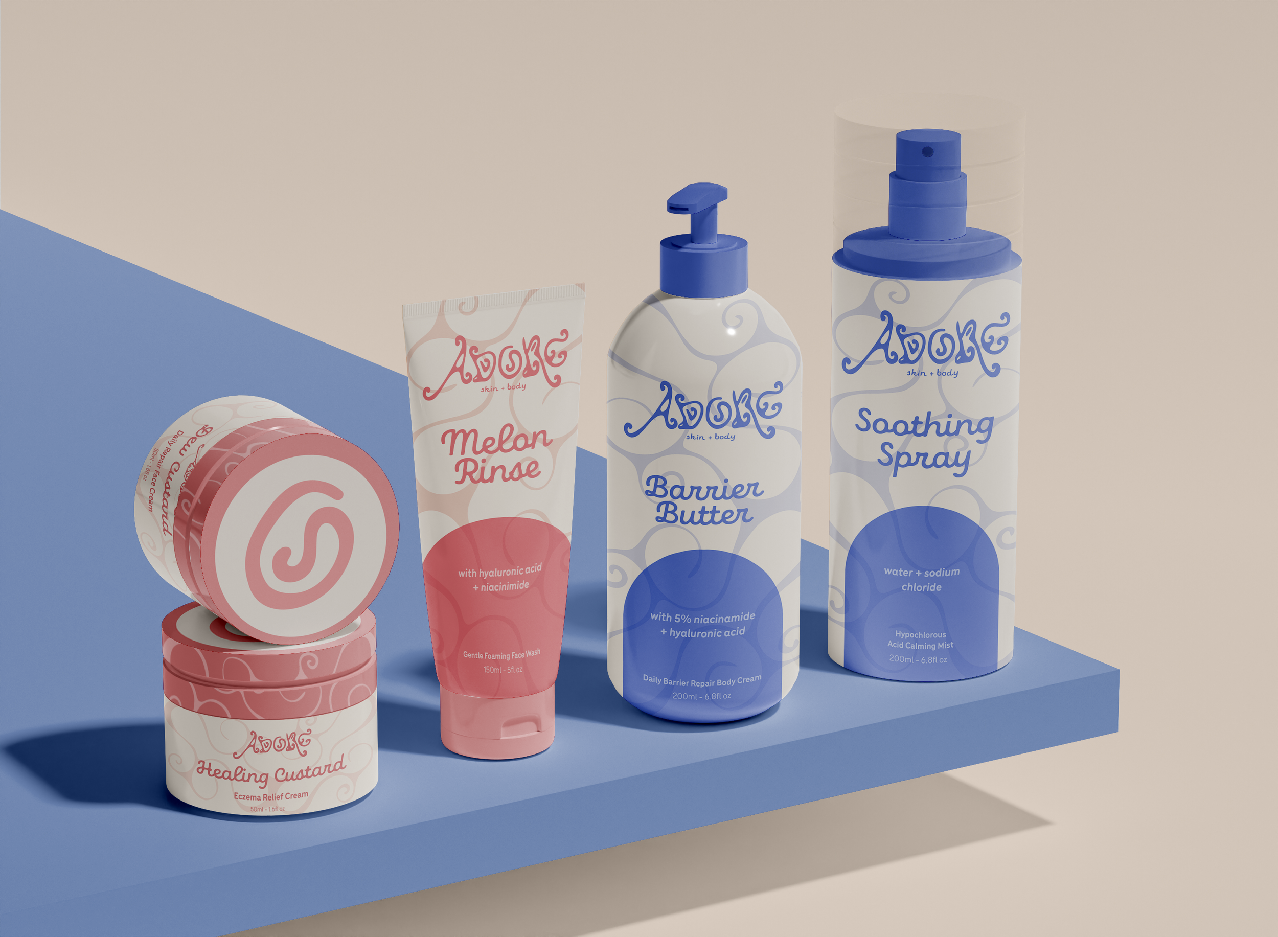
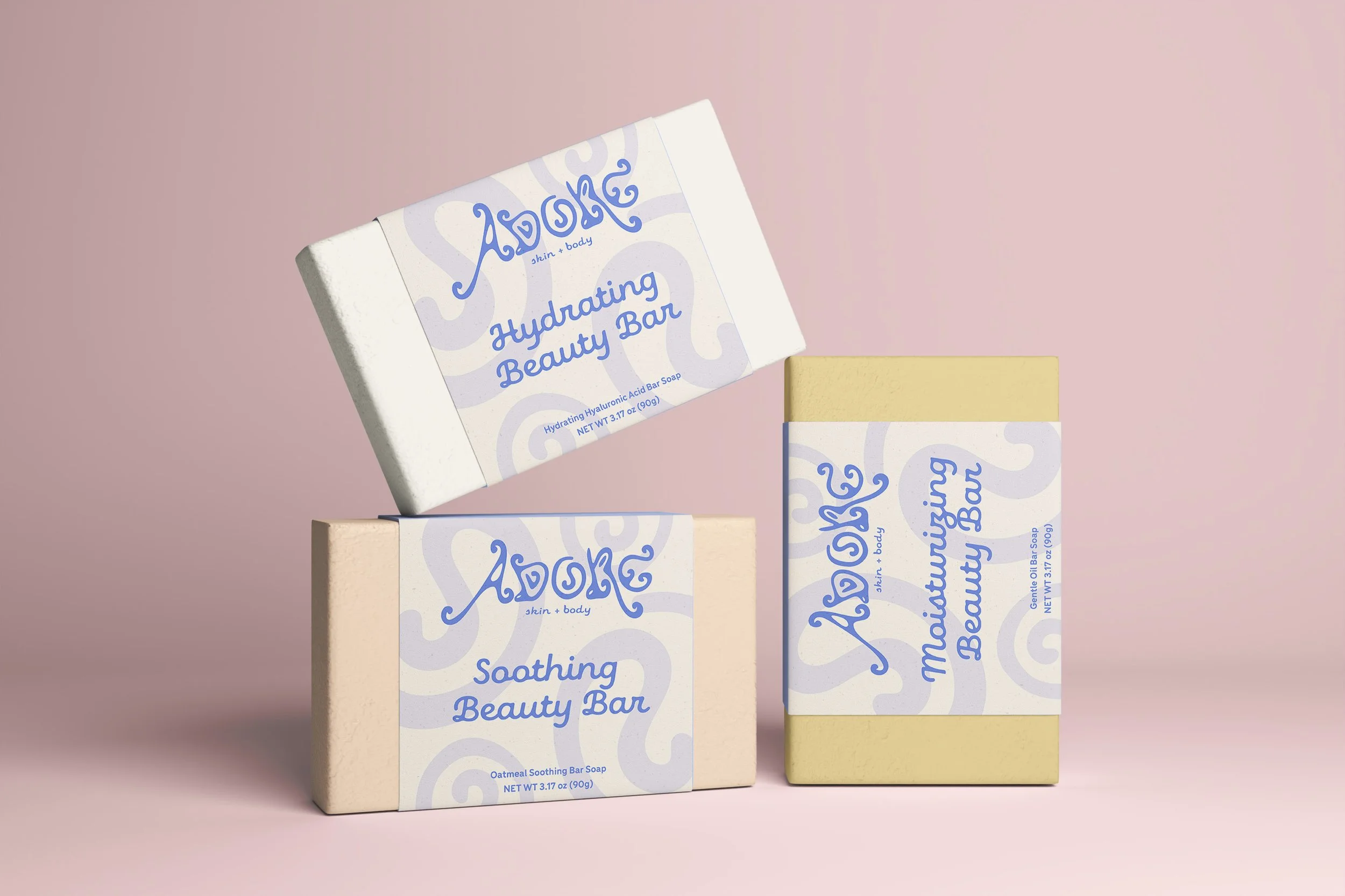
Color is used to differentiate products intended for the face versus the body, with pink representing face products and blue representing body products. This system makes it easy to understand the product line at a glance while keeping the packaging visually consistent. The illustrative swirl appears across all packaging elements to tie the system together. Each package includes the product name, active ingredients, and intended use, and the swirl from the ‘o’ in the logo is repeated on the cream lids.